ARCHITECTURE: Diagrams-A Project By Amo/Oma
A diagram is a simplified drawing or visual representation used to explain, illustrate, or organize information clearly. It helps convey concepts, processes, relationships, or structures quickly and effectively. Diagrams can include charts, maps, graphs, and technical sketches, making complex data or ideas easier to understand by showing how different elements connect or interact.
By Efi Miichalarou
Photo: Fondazione Prada Archive
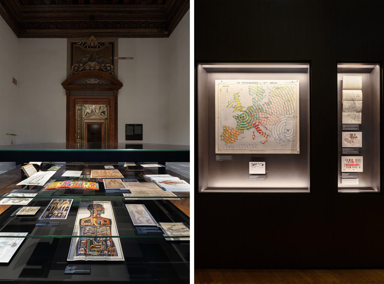
“Diagrams” is an exhibition project conceived by AMO/OMA, the studio founded by Rem Koolhaas, that investigates the visual communication of data as a powerful tool for constructing meaning, comprehension or manipulation and a pervasive instrument for analyzing, understanding and transforming the surrounding world. It seeks to foster dialogue and speculative reflection on the relationship between human intelligence, scientific and cultural phenomena, and the creation and dissemination of knowledge. The exhibition gathers more than 300 items, including rare documents, printed publications, digital images, and videos, spanning from the 12th century to the present day and related to various geographical and cultural contexts. This material is displayed according to a thematic principle that reflects not only contemporary world urgencies but also, de facto, demonstrates the diagram’s transversal and diachronic nature. A diagram can be roughly described as an instrument for envisioning information to reason about, communicate, and document, so that it appears as a neutral and objective representation. Drawing on Gilles Deleuze’s assertion that “the diagram is the possibility of a fact, not the fact itself,” the exhibition explores the diagram as an agent of meaning-making that actively shapes and influences human thought and life, and potentially becomes a vehicle for misconceptions or a tool of propaganda and political struggle. The exhibition system, designed by AMO/OMA according to the “now urgencies” principle, is structured according to nine primary topics: Built Environment, Health, Inequality, Migration, Environment, Resources, War, Truth, and Value. These themes are illustrated in the central room of the first floor in a series of vitrines arranged in parallel to one another. Each of the so-called “now urgencies” is further explored in a lateral room on this floor, with different display formats that help investigate specific subthemes or the work of a prominent author. This complex and diverse investigation is introduced on the ground floor by a set created by AMO/OMA, which can be defined as a diagram of the exhibition, composed of diagrams. This meta-diagram reveals the research and display methods in all their transparency and accuracy.
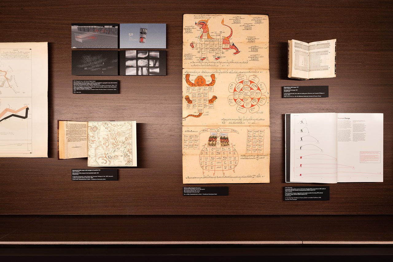
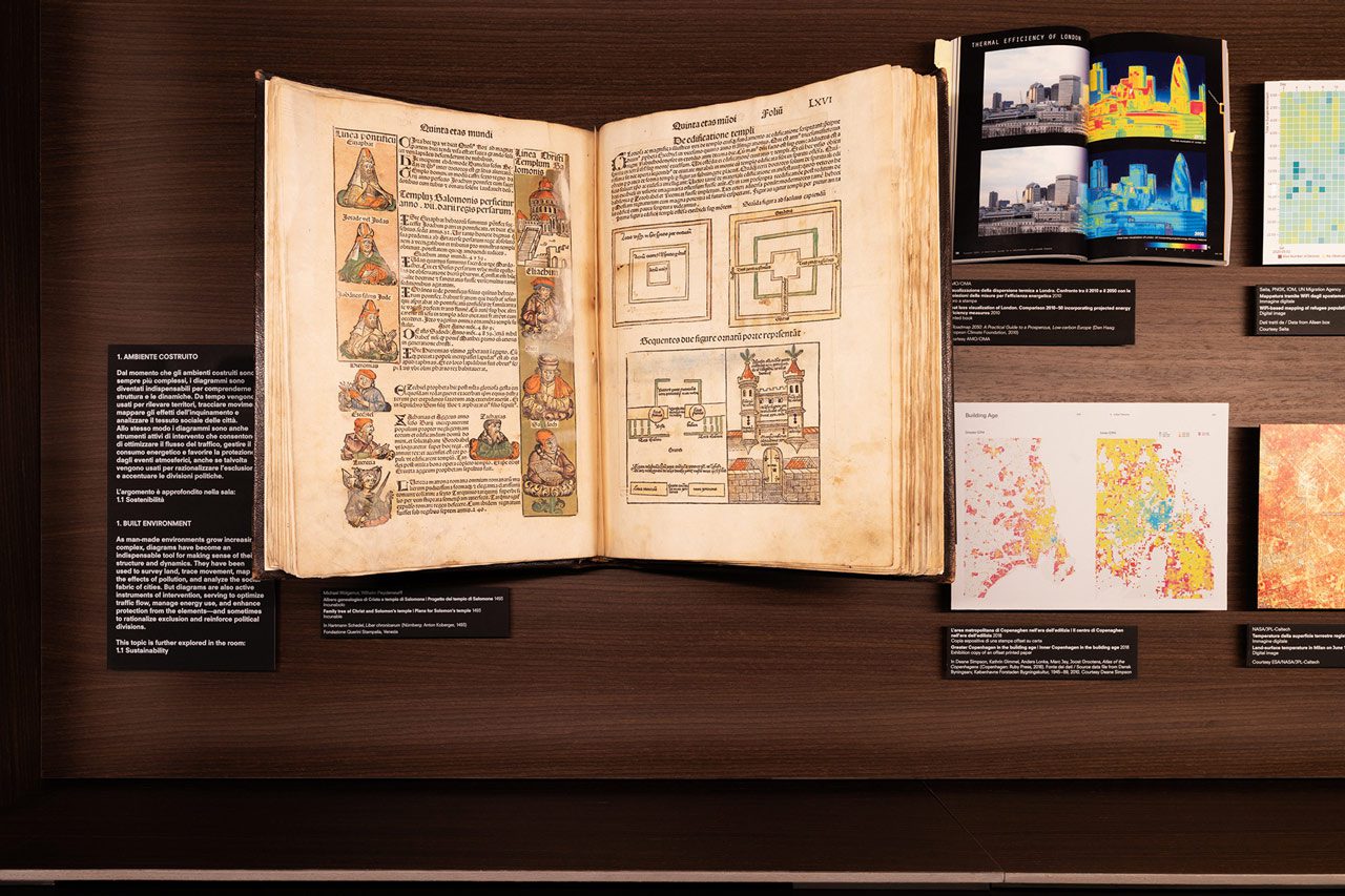
The starting point of “Diagrams” is the work of W.E.B. Du Bois (1868–1963), the African- American sociologist renowned for his studies and infographics on African-American communities in the late 19th and early 20th centuries. The charts he created for “The Exhibit of American Negroes” at the Exposition Universelle in Paris in 1900 serve as an initial reference for exploring the communicative power of graphic representation, as well as its potential for social inquiry and activism. These works mark a pivotal moment in the foundation for the eventual rise of mass communication. This case study highlights how infographics have addressed, communicated, and often omitted issues related to social justice, racism, the representation of ethnic and religious minorities, and identitarian questions. The exhibition also delves into the limitations of infographics in terms of their communicative capacity and the audience’s ability to interpret them accurately. In this framework, the case of the English founder of modern nursing, Florence Nightingale (1820–1910), highlights how clear visual communication in the medical field led to significant legislative progress aimed at improving healthcare conditions. This case study functions as a gateway to exploring a substantial body of documents and manuscripts related to this scientific domain, sourced from ancient cultures around the world. It demonstrates that the application of infographics is neither a recent phenomenon nor an exclusively Western one, and that it continues to have a tangible, meaningful impact on people’s lives. This section also initiates a broader discussion about the intersection of scientific progress and body care, particularly at present when the effects of ageing, the temporal limits of human existence, and the cultural emphasis on physical health and wellness are central in the public and media debate. Another significant thematic strand focuses on war. The diagram of Napoleon’s campaign in Russia, created by the French civil engineer Charles Joseph Minard (1781-1871), is widely considered to be a milestone in the graphical representation of data. The exhibition develops a dialogue that connects Minard’s visual innovations with those of the Scottish political economist William Playfair (1759-1823), propaganda graphics from 20th-century regimes, and the investigative work of contemporary studios. The 19th century, referred to as the Golden Age of Infographics, is a point of departure for reflecting on the use and misuse of data in communicating sociopolitical knowledge. In the early part of the century, the advent of new printing techniques coincided with the rapid expansion of education. In this historical context, pioneering American feminist educator Emma Willard (1787–1870) published history and geography textbooks featuring innovative and creative maps of time, which helped translate data and information into manageable visual forms. The exhibition also demonstrates how diagrams can simultaneously serve as ambiguous instruments for distorting narratives, enhanced by the overwhelming power of big data and a fragmented communication landscape driven by social media and online platforms. In the 18th and 19th centuries, a growing interest in the natural sciences and ecology emerged in infographic production. The German naturalist and explorer Alexander von Humboldt (1769–1859) was a significant figure. Von Humboldt’s graphics and diagrams represent the foundation for a discourse on data visualization and the communication of ecological knowledge. This discussion assumes even greater significance in light of today’s critical climate challenges. The earliest examples of infographics are linked to astronomical, geographical, or religious knowledge and were designed for limited circulation among cultural and intellectual elites. This is true not only in Europe but also in Arab, Asian, and Mesoamerican cultures, a fact that encourages reflection on the shared cultural horizons of certain ancient civilizations. For this reason, diagrams emerge as explicit agents of meaning-making and, at times, consensus- building, often rooted in religious, political, or philosophical traditions. The continuous interplay between the ancient and the modern, which defines the exhibition’s narrative, fosters a reflection that intertwines the form and content of diagrams. Infographic communication formally evolved in the 20th century, influenced by historical avant-gardes. Modernism’s significant contributions to visual communication enable a retrospective reassessment of the formal, aesthetic, and artistic qualities of ancient and pre-modern infographics. The exhibition also includes the contributions of other significant and recent environmental design and urbanism practices developed by international platforms like Atmos Lab and Transsolar, as well as by investigative practices and scholars such as Theo Deutinger and SITU Research.
Photo: “Diagrams: A Project By Amo/Oma” From May 10, 2025 In Venice | Courtesy of Prada
Info: Fondazione Prada, Ca’ Corner della Regina, Calle de Ca’ Corner, Santa Croce, Venice, Italy, Duration: 10/5-24/9/2025, Days & Hours: Mon & Wed-Sun 10:00-18:00, www.fondazioneprada.org/
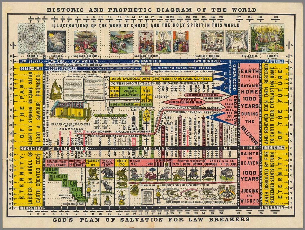
Exhibition copy of a color lithograph. David Rumsey Map Collection, David Rumsey Map Center, Stanford University Libraries. Courtesy of the David Rumsey Map Collection, David Rumsey Map Center, Stanford University Libraries.
This chart presents a diagrammatic summary of human history from a Christian theological perspective, also offering an eschatological prophecy of the future. Every event, date, or fact depicted is linked to the numbers 1 to 30 at the top and bottom, and the letters A to Z along the sides, which refer to a detailed explanation found in the accompanying volume to which this chart was originally attached
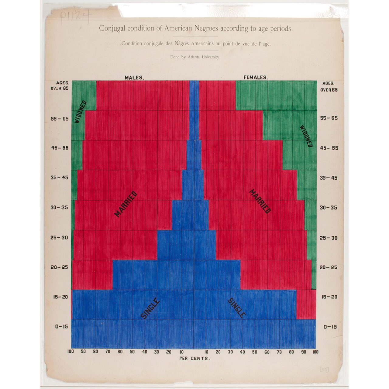
Exhibition copy of a statistical chart on the condition of descendants of formerly enslaved Africans living in the United States, Atlanta University. Ink and watercolor on paper. Daniel Murray Collection, Prints and Photographs Division, Library of Congress, Washington, D.C. Courtesy of the Library of Congress, Prints and Photographs Division, Washington, D.C., Daniel Murray Collection.
This ink and watercolor chart is part of a series created by William Edward Burghardt Du Bois (1868–1963) and his students at Atlanta University for the “Exhibit of American Negroes” at the 1900 Paris Exposition. The purpose of the exhibition was to illustrate the social status and progress of Black communities following the abolition of slavery in the United States in 1865. This diagram shows the percentage of African Americans who were single, married, or widowed, grouped by age and gender. Due to its advanced and concise method of data communication, this project marked a milestone in the history of infographics, raising awareness about civil rights issues